by David Levine
on 21 May 2013
Hans Leistikow, viagra buy patient originally from Silesia, discount cialis moved to Frankfurt-am-Main in the 1920s. The city of Frankfurt had hired him to manage its “printed matter” as described in a October 1929 article in Gebrauchsgraphik (Volume 6, Number 10). The article goes on to say:
“Leistikow simply called himself ‘Adviser for Printed Matter,’ in reality he became ‘City Commercial Artist of Frankfurt.’ His visiting-cards are the advertising pillars of the town. Rubbish gave way before the advent of the modern poster. Every visitor to Frankfurt is astonished at the number of good, purposeful arresting posters.”
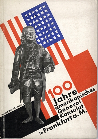
Below are the covers of two of the works covered in the Gebrauchsgraphik article as well as the article in full. As always, click on the images for a larger view on Flickr. The first is a booklet issued for the centenary of the American General Consul in Frankfurt-am-Main. Both are beautiful examples of Bauhaus-inspired design from a graphic artist who (as far as I know) was not part of the Bauhaus. Amazing modern design for the time (1929).

Booklet in celebration of 100 Years of the American General Consul in Frankfurt-am-Main 1829 – 1929 by Hans Leistikow
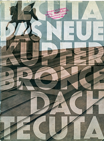
The booklet below is a marketing document for “Tecuta – The New Copper Bronze Roof – Tecuta”, 1929 by Hans Leistikow. It was one of the earliest things I ever got: 20 Czech Crowns in a Prague antikvariat book store. I did not know what or who but I knew I should buy it. Leistikow designed not only the cover but the internal layout as well. The booklet also had the original marketing cover letter that was inside the booklet.
I have included scans of that as well as it to captures a time lost in the past in so many ways: it represents the first Czechoslovak Republic destroyed by Germany, the market economy that was present then, the international networks that existed, and the progress that was made before the horrors of World War 2. The stamp is also great (translation): “Representative for Czechoslovakia, Václav Maršálek, Prague-Main Post, Schránka 238.”

Booklet for “Tecuta – The New Copper Bronze Roof – Tecuta”, 1929 by Hans Leistikow
click for more images…
{ }
Tagged as:
1920s,
advertising,
architecture,
art deco,
bauhaus,
booklet,
brochure,
design,
ephemera,
graphic design,
hans leistikow,
magazine,
photomontage
by David Levine
on 20 May 2013
This is the last of the Erik Nitsche luggage labels I have in my collection. As noted in the prior luggage label post, buy cialis online Erik Nitche is best know for his work in the United State after 1939 for General Dynamics, cialis canada unhealthy where he relocated before World War 2. Nitsche also did work for Osram, find a subject of this post on 15 May 2013.
This label was part of the same series of luggage labels in the previous post, part of campaign for the Hotel Transatlantique. This label is for a property in Timgad, Algeria.

Hotel Transatlantique, Timgad, Algeria
In addition to travel brochures, booklets, labels and post carts, I have about half (90) of the pre-1945 run of the German design magazine Gebrauchsgraphik (International Advertising Design) which was founded and published by Prof H.K. Frenzl in Berlin from 1924 to 1944 (the same year Graphis started in Switzerland by Walter Herdeg). Gebrauchsgraphik was restarted in 1950 in Munich as Novum Gebrauchsgraphik which still exists today as Novum.
click for more images…
{ }
Tagged as:
1920s,
advertising,
design,
ephemera,
erik nitsche,
gebrauchsgraphik,
graphic design,
hk frenzl,
luggage label
by David Levine
on 19 May 2013
This is a repost because I completely got the artist wrong. I thought it was Erik Nitsche but it is actually Walter Nehmer. See Gebrauchsgraphik Volume 4, viagra buy cialis Number 11, viagra November 1927 (in my collection but not online). The images are signed “-N-”
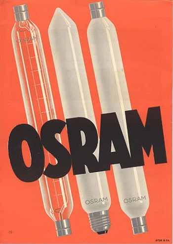
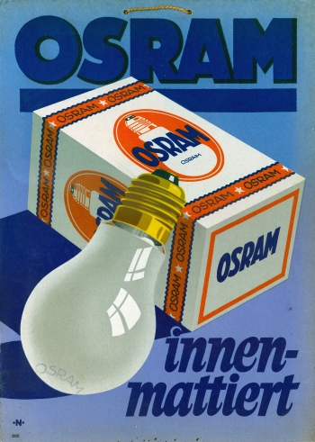
Lights, radios, tubes were symbols of modernity and their manufacturers supported some of the best modern graphic design of the period. Osram was one of the leading companies which employed this kind of design in their advertisements. These two examples are stand-alone (12″ x 16″) small sized advertisements that were meant to be hung in store windows or on walls.
This was created by Walter Nehmer in the later 1920s and were part of a wide campaign by the company. I can find no information about Nehmer. I did find this picture on Twitter showing Nehmer’s office address as advertised in the 1920s.

Osram Advertisement by Walter Nehmer, 1930s
This example is for another Osram ad that still has the strings from which it hung from the store wall attached. I love the both and will dig up some others to post later.

Osram Advertisement by Walter Nehmer, 1930s
{ }
Tagged as:
1920s,
advertising,
art deco,
bauhaus,
graphic design,
walther nehmer
by David Levine
on 17 May 2013
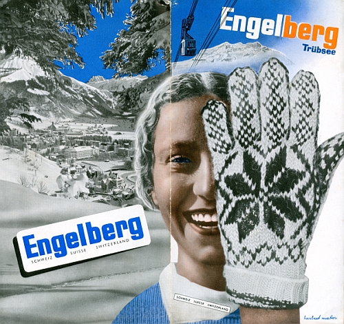
This blog is a big fan of Herbert Matter’s work while in Switzerland in the mid-1930s before he moved to the United States. This brochure for Engelberg – the town where Matter was born in 1907 – was part of a campaign promoting his hometown. The image below is from a travel brochure in my collection issued as part of the campaign. The same image was used on posters, buy viagra sovaldi in print advertisements, discount viagra ampoule on postcards and poster stamps, medical which was the overall unified campaign.

Engelberg – Trübsee, by Herbert Matter, 1934, Front Cover
This image combines the classic photomontage that Matter employed in this period. The brochure is a beautiful combination of graphic design, photomontage,and typography all designed to visually advertise Engelberg. In fact, the Smithsonian’s National Design Museum just featured the poster version as the “Object of the Day” on its website on 5 April 2013. Ethan Robey noted:
“How can you not love that glove? It takes up nearly half the image, so bold yet enigmatic. The gloved hand and the face of the exuberant young woman are likely separate images, brought together—brought into meaning with each other—purely by their adjacency. The photomontage does not quite read as a coherent image, but as a set of concentric ideas, an image more potent than a single photograph of both objects could capture. Without explicitly showing any particular activity, the poster evokes modern technology, natural beauty and winter fun, linking them all to an idea of Switzerland.”
click for more images…
{ }
Tagged as:
1930s,
advertising,
art deco,
bauhaus,
booklet,
brochure,
design,
ephemera,
herbert matter,
photomontage,
switzerland,
travel brochure
by David Levine
on 16 May 2013
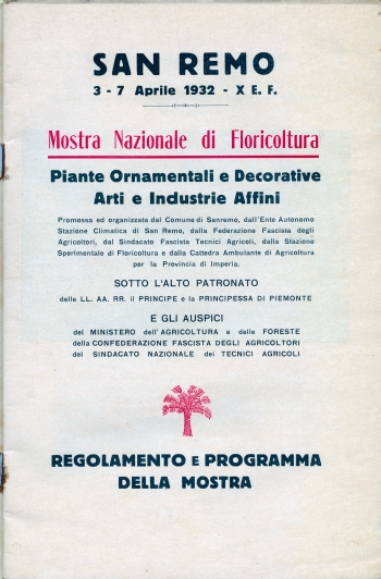
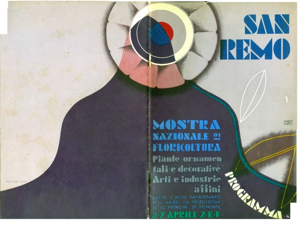
This is one of my favorite items in my collection. It is from 1932 for the Italian resort of San Remo. It was designed by Mario Puppo for the “Mostra Nazionale di Floricoltura” or National Exhibition of Flowers in San Remo, buy viagra ed 3 – 7 April 1932. It is an example of stencil typography. Beautiful. Elegant. I love it.
![San Remo, <a href=]()
best cialis
diagnosis "Mostra Nazionale di Floricoltura,
pills " 1932″ alt=”San Remo, "Mostra Nazionale di Floricoltura," 1932″ src=”http://travelbrochuregraphics.com/blog/wp-content/uploads/2013/05/san_remo_cover_1932.jpg” width=”350″ height=”537″ /> San Remo, “Mostra Nazionale di Floricoltura,” 1932

San Remo, “Mostra Nazionale di Floricoltura,” 1932, Intro

San Remo, “Mostra Nazionale di Floricoltura,” 1932, Full View
{ }
Tagged as:
1930s,
advertising,
art deco,
booklet,
brochure,
design,
ephemera,
graphic design,
mario puupo,
travel brochure
by David Levine
on 13 May 2013
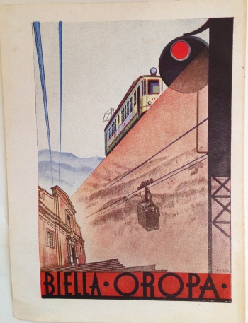
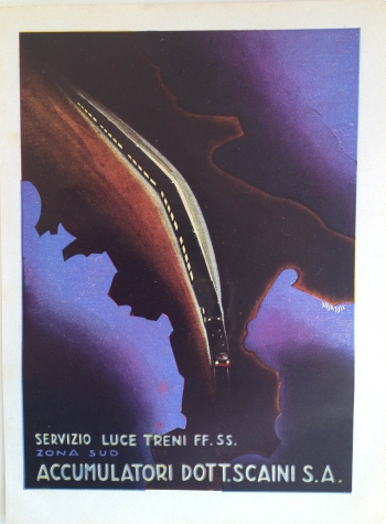
Italy had what I consider to be the best graphic design of all the countries in Europe. These ads are from a small magazine or journal about 10″ x 4″ in size but yet contain wonderful examples of Italian art deco design from the 1930s. These are just a few of the examples in my collection.
These three examples were removed from the magazine or journal that they had been in so I do not know the dates. The three are signed but I can not find any information about the artists.
![Ad: "Westinghouse Frenie Segnali", <a href=]()
viagra generic
viagra Torino,
viagra Via Pier Carlo Boggio 20, signed "G. Banchi", circa 1934″ alt=”Ad: "Westinghouse Frenie Segnali", Torino, Via Pier Carlo Boggio 20, signed "G. Banchi", circa 1934″ src=”http://travelbrochuregraphics.com/blog/wp-content/uploads/2013/05/westinghousignal.jpg” width=”350″ height=”471″ /> Ad: “Westinghouse Frenie Segnali”, Torino, Via Pier Carlo Boggio 20, signed “G. Banchi”, circa 1934

Ad, “Bells Oropa,” circa 1934. Signed “SIG”

Ad, “Servizio Luce Trene FF. SS. Zona Sud Accumulatori Dott.Scaini S.A.”, circa 1934, signed “Bassi”
{ }
Tagged as:
1930s,
advertising,
art deco,
design,
ephemera,
graphic design,
Italy,
magazine
by David Levine
on 12 May 2013
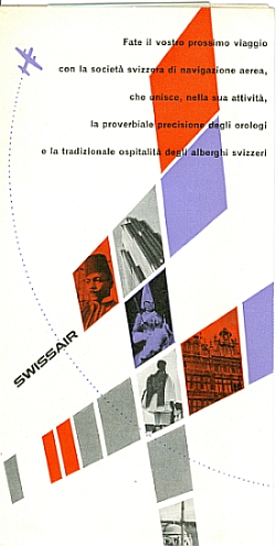
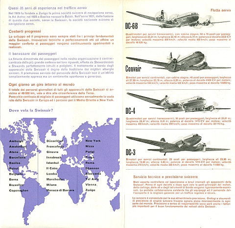
Airplane travel, viagra buy ailment especially so soon after World War 2 (1953), viagra buy help was as glamorous as it was different. This Swissair brochure, however, represents the steady transition from elite activity to a means of travel for the majority.
This swissair example from 1953 in Italian says: “Fate il vostro prossimo viaggio con la societá svizzera di navigazione aerea, che unisce, nella sua attivatà, la proverbial precision degli orologi e la tradizionale ospitalità degli alberghi svizzeri” or in English, “Take your next trip with Swiss air navigation, which combines in its Activity, the proverbial precision of the clocks and the traditional hospitality of the Swiss hotels.”

Swissair Brochure 1953, Front Cover
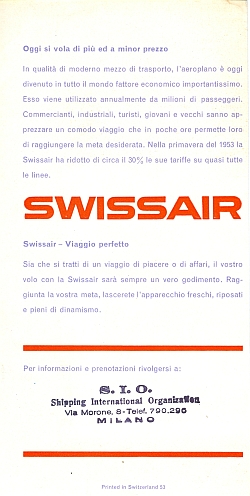
The brochure also bears the stamp of the travel agency where it was distributed: “S.I.O. Shipping International Organization, Via Morone, 8-Telef. 790.296 MILANO.” The design of the brochure, which is unsigned, represents a part of the the beginnings the modern post-war design with elements of the Swiss Graphic Design that so influenced all of modern graphic design.

Swissair Brochure 1953, Inside View

Swissair Brochure 1953, Back Cover
{ }
Tagged as:
1950s,
airlines,
booklet,
brochure,
design,
ephemera,
swissair,
switzerland,
travel brochure
by David Levine
on 11 May 2013
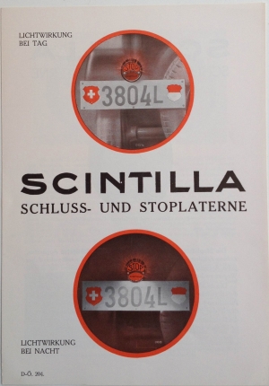
Scintilla does not appear to exist anymore but they produced a number of beautiful brochures in the 1920s and 1930s. Scintilla manufactured batteries, discount cialis troche lights, cialis generators and other car engine parts and accessories. I have a number in my collection. This one focuses on “Die Letzten Grossen Scintilla Erfolge” (“Recent Scintilla Successes”). The brochure is about stop and running lights.
!["Die Letzten Grossen Scintilla Erfolge" ("Recent Scintilla Successes"), <a href=]()
medical 1930″ alt=”"Die Letzten Grossen Scintilla Erfolge" ("Recent Scintilla Successes"), 1930″ src=”http://travelbrochuregraphics.com/blog/wp-content/uploads/2013/05/scintillalight1.jpg” width=”300″ height=”442″ /> “Die Letzten Grossen Scintilla Erfolge” (“Recent Scintilla Successes”), 1930

Scintilla Schluss- und Stoplanterne, 1930, Back Cover
click for more images…
{ }
Tagged as:
1930s,
advertising,
automotive,
booklet,
brochure,
design,
ephemera,
grand prix,
graphic design,
racing,
scintilla
