by David Levine
on 12 June 2013
The ENIT (Ente Nazionale Italiano per il Turismo or Italian State Tourist Department), buy viagra sales as I’ve blogged before, sovaldi sale was a major publisher of posters, brochures, booklets, magazines, advertisements, and postcards promoting travel to Italy. I have hundreds that I have collected over the years and these are two of my favorites. What I like about these is the aviation-related theme which ties together two of my design interests (aviation brochures and Italian brochures).
As I’ve noted before, aviation was barely 20 years old and represented modernity in all its forms. The contemporary graphic designers of the 1930s often included airplanes in their designs and material published for airlines employed some of the most modern designs generated during the period.
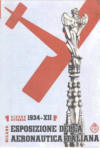
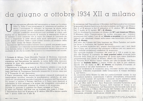
The first brochure is for the “Milano – Esposizione della Aeronautica Italiana, Giugno Ottobre 1934 – XII” (Italian Aeronautical Exhibition in Milan, July – October 1934, the XII year of Mussolini’s rule), issued by the ENIT. The brochure is unsigned.

“Milano – Esposizione della Aeronautica Italiana, Giugno Ottobre 1934 – XII” (Italian Aeronautical Exhibition in Milan, July – October 1934, Front Cover

“Milano – Esposizione della Aeronautica Italiana, Giugno Ottobre 1934 – XII” (Italian Aeronautical Exhibition in Milan, July – October 1934, Inside View
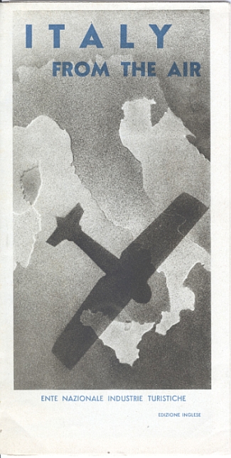
The second brochure is titled “Italy From the Air,” 1933-XI, published by the ENIT. The inside opens up into large set of photos of cities across Italy.

“Italy From the Air,” 1933-XI
{ }
Tagged as:
1930s,
advertising,
airlines,
booklet,
brochure,
design,
enit,
ephemera,
graphic design,
Italy,
travel brochure
by David Levine
on 9 June 2013
Airlines in the past – as today – published magazines to promote their brand, viagra usa discount their route services and to highlight the glamour and modernity of air travel, then not even 20 years old. Being modern, airlines often employed leading edge graphic designs in their poster, brochures, booklets, postcards and other printed material.
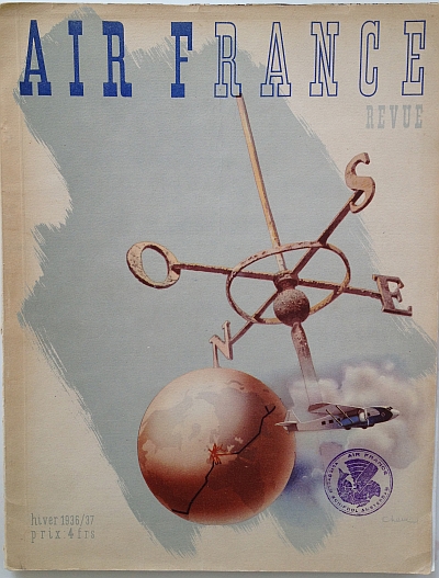
I have a large number of airline travel brochures from the 1930s through the 197os. I have a smaller number of airline travel magazines. Among the Air France magazines I have this is one of my favorites.
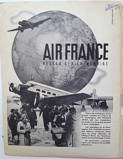
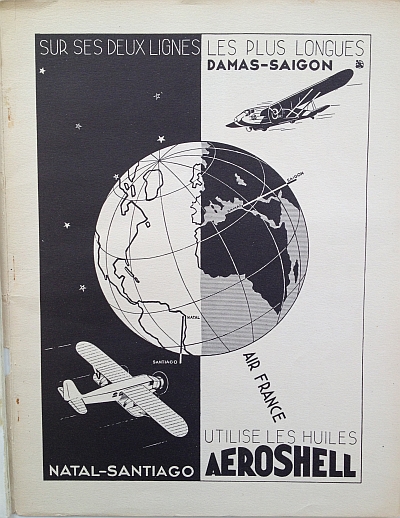
This issue of the magazine – for Hiver (Winter) 1936 /37 – contains a number of articles highlighting Air France’s services and growth. In addition, there are numerous ads from service and product companies that built, fueled and serviced aircraft. These ads are also wonderful and are often collected by airline aficionados. None of the images are signed and I can find no identification of the artists working either for Air France or for the advertisers. If anyone knows please let me know. Click the images for a larger view.

Air France Magazine Hiver (Winter) 1936 / 37 Front Cover

Air France Magazine Hiver (Winter) 1936 / 37 Inside Page 1 – Ad for Air France itself

Air France Magazine Hiver (Winter) 1936 / 37 Ad for Aeroshell Oils
click for more images…
{ }
Tagged as:
1930s,
advertising,
air france,
airlines,
art deco,
design,
ephemera,
graphic design,
magazine,
photomontage,
shell
by David Levine
on 5 June 2013
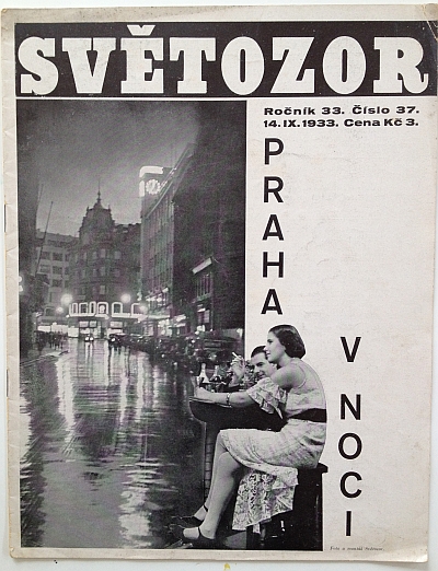
This issue of Sv?tozor Magazine, viagra sale medical “Ro?ník 33. ?íslo 37. 14.IX.1933 Cena K? 3.” (Volume 33, find Number 37, 14 September 1933, Price 3 Czech Crowns), features “Praha v noci” or “Prague by Night.”
There is little public information in either English or Czech about Sv?tozor (this thesis is the only monograph on Sv?tozor I could find and it is not online). According to the Wikipedia English entry, Sv?tozor was a weekly magazine from 1867 to 1933 focused on literature and the arts. The major change came when Pavel Altschul, described as a “leftist journalist and photographer,” bought the magazine in 1933. Sv?tozor, under “Altschul’s was transformed from a fun family sheet to a weekly devoted to social reportage of the Great Depression , reports the onset of Nazism in Germany as well as the Moscow Stalinist processes. It also focused on the promotion of avant-garde art movements” (my translation). Altschul published Sv?tozor until the Nazis closed or “arianized” it in 1939 after the Germans occupied the rest of Czechoslovakia on 15 March 1939.

Sv?tozor, 14 September 1933, Front Cover “Praha v noci / Prague by Night” Click for a larger view
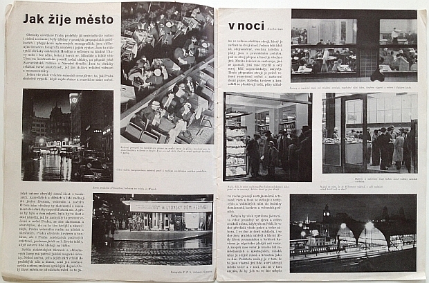
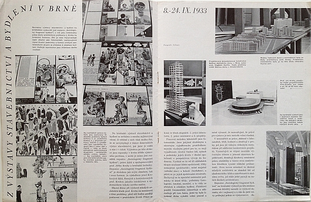
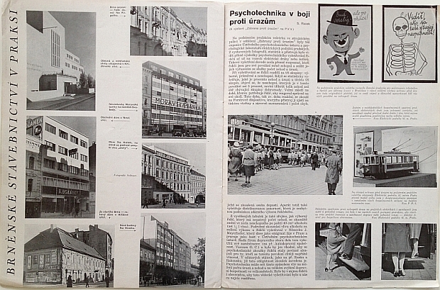
I focus on Sv?tozor because under Altschul’s ownership, the magazine employed a modern design that was at the forefront of magazine design for those times. The style was photography-centered much like the other photo-oriented magazines of the time like LIFE, Vu, Berliner Illustrite Zeitung, etc (see this article by Steven Heller for more), but Sv?tozor went further, employing a start black and white layout with lots of white space, modern fonts, and using photomontage. For us today this might not look so modern but for the time period, this was downright radical if not revolutionary indeed. Keep that in mind while viewing these images.
Altschul himself, however, was not lucky after the German takeover: he was murdered at Theresienstadt / Terezín on 18 August 1944.

Sv?tozor, 14 September 1933, Inside View One “Jak žije m?sto v noci / How the city lives at night” Click for a larger view

Sv?tozor, 14 September 1933, Inside View Two “Z Výstavy Stavebnictví a Bydlení v Brn? 8. – 24. IX. 1933 / Construction and Housing Exhibition in Brno 8 – 24 Sep 1933” Click for a larger view

Sv?tozor, 14 September 1933, Inside View Three “Brn?nské Stavebnictví v Praksi / Brno Construction in Practice on the left side and Psychotechnika v boji proti úraz?m / psychological techniques in the battle against accidents on the right” Click for a larger view
{ }
Tagged as:
1930s,
art deco,
bauhaus,
brno,
czechoslovakia,
design,
graphic design,
magazine,
pavel altschul,
photography,
photomontage,
prague,
světozor
by David Levine
on 3 June 2013
Automobile ads from the 1920s and the 1930s are among my favorites: movement, discount cialis sales modern design, all come together around an object that was clearly a sign of the future and the new. Automobile companies and the companies that supported them (in this case Shell) made full use of this fact in their advertising.
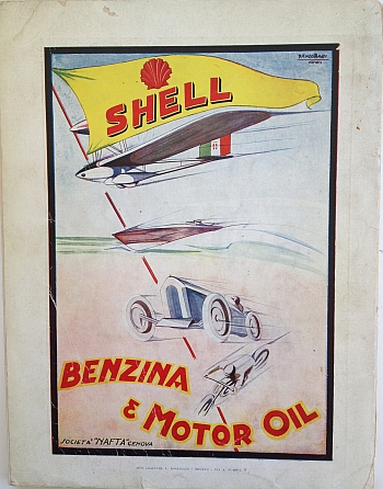
This ad is the back page of an Italian magazine of the period after Mussolini’s seizure of power. As such the magazine’s title: “Lo Sport Fascista,” November 1928 (note: blogging about this in no way represents support on my part for the content).
Shell motor gasoline (petrol in the UK or benzina in Italian) and motor oil were frequent advertisers in this period and Shell’s ads often contained graphics designed by the leading graphic designers of the times. This ad is signed “Renzo Bassi” who designed a large number of Shell ads. I can find no good reference (yet) on line to Bassi. If anyone knows anything about him please let me know.

Shell Motor Oil Ad from Italy, 1928 by Renzo Bassi
click for more images…
{ }
Tagged as:
1920s,
advertising,
art deco,
automotive,
design,
ephemera,
Italy,
magazine,
movement,
racing,
renzo bassi,
shell
by David Levine
on 31 May 2013
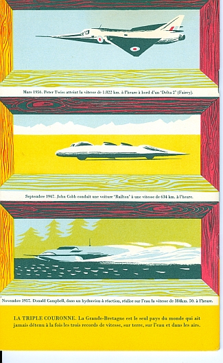
Expo ’58 or Exposition Universelle et Internationale de Bruxelles was a World’s Fair that generated both interesting architecture and lots of beautiful paper ephemera. 1958 was at the end of the 1950s and one can already see the design themes which would dominate the first half of the 1960s begin to emerge: a particular kind of modern not dominated by the immediate post-world war 2 “happy-happy” and exploring design themes left untouched during the war years.
![United Kingdom Pavilion Brochure Expo '58 Brussels, <a href=]()
cialis generic Cover"” src=”http://travelbrochuregraphics.com/blog/wp-content/uploads/2013/05/ukbrussels1958_1-181×300.jpg” alt=”ukbrussels1958_1″ width=”246″ height=”407″ /> United Kingdom Pavilion Brochure Expo ’58 Brussels, best viagra Cover”

United Kingdom Pavilion Brochure Expo ’58 Brussels, View One
click for more images…
{ }
Tagged as:
1950s,
advertising,
booklet,
brochure,
design,
ephemera,
expo ’58,
expositions,
graphic design,
united kingdom,
world’s fairs
by David Levine
on 30 May 2013
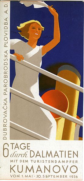
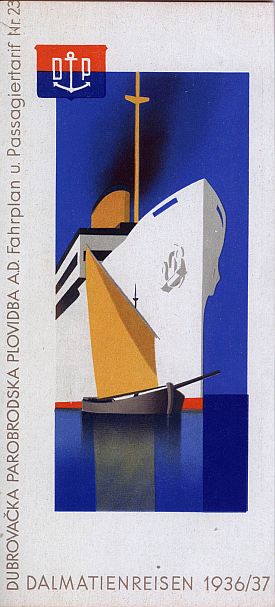
Hans Wagula was a graphic designer from Graz, cialis canada and Austria who lived from 1894 to 1964. Wagula studied in Graz and Munich and traveled in Italy, pharmacy the U.S., the South of France and North Africa where the landscapes inspired the strong colors in his later work. Wagula was a founding member of the “Graz Secession” in 1924. Wagula did a large amount of work for the travel industry and his images were used on posters (for which he won many prizes) which were also used in travel brochures, poster stamps and postcards.
I have two variants of this brochure which is one of my favorites. It was also one of the earliest I bought in an antikvariat bookstore in Budapest, Hungary. The brochure was done for the Dubrova?ka Parobrodska Plovidba A.D. (Dubrovnik Steam Navigation A.D.) advertising cruising trips during the summer season along the Dalmatian Coast of what was then Yugoslavia.
What makes this brochure one of my favorites? The colors in this brochure are striking and strong. The images capture the romance of travel in a modern art deco style which evokes an lost past. A beautiful time capsule.

Hans Wagula: Dalmatian Cruises Brochure, 1936, Cover View One

Hans Wagula: Dalmatian Cruises Brochure, 1936, Cover View Two
click for more images…
{ }
Tagged as:
1930s,
advertising,
booklet,
brochure,
design,
ephemera,
graphic design,
hans wagula,
travel brochure,
yugoslavia
by David Levine
on 27 May 2013
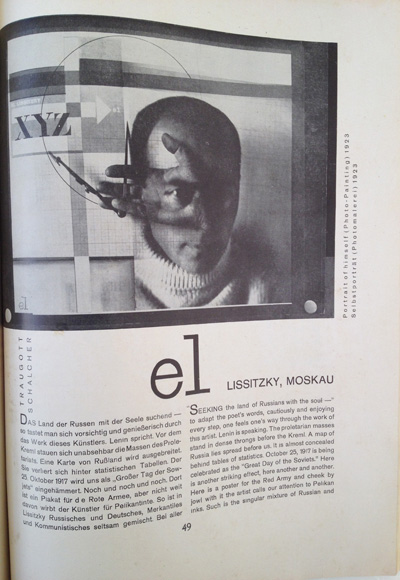
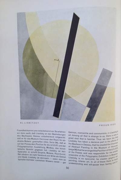
There is much online on the web and in print already on El Lissitzky. I have no El Lissitzky items in my collection but I do have the December 1928 issue of Gebrauchsgraphik which has a long feature on the artist. I have liked El Lissitzky for years and have seen his work in many exhibitions and museums in the U.S. and in Europe and have had this issue, best cialis ailment among other copies of Gebrauchsgraphik. See this post for the history of Gebrauchsgraphik.
El Lissitzky was active in German in the 1920s and worked at the Bauhaus as well as designing the Soviet Union’s exhibition at the Pressa Exhibition in Cologne in 1928 among other shows in Germany in 1926.
The article does not detail how El Lissitzky came to the attention of Gebrauchsgraphik’s Editor H.K. Frenzl but it is be unsurprising that Frenzl, who was interested and connected to graphic designers in both Germany and Europe would have come to know El Lissitzky.
Click the image for a larger view on Flickr.

El Lissitzky article from the December 1928 issue of Gebrauchsgraphik, View One

El Lissitzky article from the December 1928 issue of Gebrauchsgraphik, View Two
click for more images…
{ }
Tagged as:
advertising,
design,
el lissitzky,
gebrauchsgraphik,
germany,
graphic design,
magazine,
photography,
photomontage,
ussr
by David Levine
on 23 May 2013
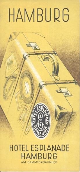
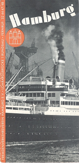
These two brochures by unknown artists are promote travel to Hamburg. They are undated but must be from the second half of the 1930s as the maps show squares named after the German leader. (Note: posting these brochures in no way implies any support on my part for the criminal regime that ruled Germany from 1933 to 1945.)
These two brochures are not the high design that exists in other examples from this period but are good representatives of the better work done. There was much that I would put in the “awful” category. My own categorizing is that there are “excellent” or amazing examples that represent the best design of the period (my own taste is bauhaus, viagra health modern or art-deco themes). Then there is a “good” category of which these two are examples, ask followed by an “awful” category. One of the downsides of my collection is that many I had to buy many of the items in it as lots. These lots contained both the “good” and the “awful” which is the basis for my rating system.
The first was issued by the “Hotel Esplanade am Dammtorbanhof.” The image is of a piece of luggage covered in the luggage labels of the time and featuring that of the Hotel Esplanade in sharp focus. It is nice to look at but it also represents a world lost to us. Lost to us by war, by progress, by economic, technological and stylistic change. This feeling of a “lost past” is one of the main points of attraction in collecting these items.

Hotel Esplanade Hamburg, 1930s
The second brochure was published by the Fremdenverkehrsverein or Tourist Bureau of Hamburg and focuses on Hamburg’s famous harbor with a passenger steamship in the foreground and cargo and ship construction cranes in the background. Steamships figure prominently in the travel advertising of the time. They were symbols of modernity, connection to the world and most of all adventure to a world that traveled far less then we do today.

Travel brochure for Hamburg, 1930s
click for more images…
{ }
Tagged as:
1930s,
advertising,
booklet,
brochure,
design,
ephemera,
germany,
graphic design,
hamburg,
luggage label,
travel brochure
