by David Levine
on 29 June 2013
This is a unique item in my collection. It has the shape and size of a label but it is plastic and transparent – I’m not sure what it was meant to be but it’s a wonderful piece. I bought it over 20 years ago from antikvariat book store in Hungary and have never seen another example.

The label was issued for the “Wohnung und Werkraum Deutsche Werkbund Exhibition” in Breslau, viagra usa pharmacy 1929. The label design is by Johannes Molzahn who designed the range of marketing collateral for this exhibition. The exhibition was hosted by the Silesian chapter of the Deutsche Werkbund and focused on the architecture of housing. Wikipedia has a gallery of the houses in Breslau (now Wroc?aw, viagra usa Poland).
According to the New York MoMA:
Molzahn was a painter-turned-typographer who studied at the art school in Weimar that became the Bauhaus in 1919. He taught typography and graphic design in Magdeburg, Germany, before moving to the Breslau Kunstakademie (art school) in 1928, and was a founding member of the Ring Neuer Werbegestalterr (Circle of new advertising designers). Throughout the 1920s he remained in close touch with Walter Gropius and other members of the Deutsche Werkbund, the German association for industrial design reform that commissioned stationery, publicity materials, and posters from several adherents of The New Typography.
Molzahn was one of the many artists who work was considered “Degenerate Art” (“entartete Kunst” in German). His work was included in the notorious “entartete Kunst” exhibition held in Munich in 1937. Molzahn emigrated to the USA in 1938 where he remained until going back to postwar West Germany in 1959.
{ }
Tagged as:
1920s,
architecture,
art deco,
bauhaus,
breslau,
design,
ephemera,
expositions,
germany,
graphic design,
johannes molzahn,
luggage label,
photomontage,
werkbund
by David Levine
on 26 June 2013
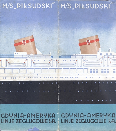
This blog has featured two Polish items over the last two months. The prewar Polish designers embraced the best of era’s design and these two items do not disappoint. These are two brochures for the oceanliner M/S “Pi?sudski” which sailed under the Gdynia-Ameryka Linje Zeglugowe S.S. (aka Gdynia America Line).
According to this website (translated from the Polish): “At the end of October 1932 it was decided to build larger and more comfortable ships. In November of 1933, best cialis nurse the company commissioned the Italian shipyard to build two passenger motorboats. Built by the Italians, viagra generic the liners had a modern silhouette and were very comfortable. They had shops, bars, cafes, swimming pool, gym, playground areas, promenades and verandas. In December of 1934, the first ship was launched which was given the name ‘Pi?sudski.'” Unfortunately, as World War II got underway, the Pi?sudski was sunk on 26 November 1939 off the coast of England (it is unknown if was a mine or a torpedo).

M/S “Pi?sudski”, 1935 Brochure, Cover
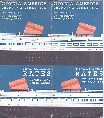
The two brochures are from 1935 and 1936. Both represent the same image of the boat. However, the 1935 brochure is far more striking and well designed in my opinion. The design represents what I consider the “height” of prewar art deco / modern design ascetic. The 1936 brochure remains interesting, though at different level of design sophistication (one I would actually call derivative) as if the management of the Gydnia America Line hired a lesser artist who simply reversed and recycled the previous year’s image and fell back on a boring if not more standard font for the text.
The 1935 brochure is also more sumptuous: it contains views of the interior of the liner and its appointments; the 1936 brochure is simply a timetable.

M/S “Pi?sudski”, 1936 Brochure, Cover
click for more images…
{ }
Tagged as:
1930s,
advertising,
art deco,
booklet,
brochure,
design,
ephemera,
graphic design,
oceanliner,
poland,
travel brochure
by David Levine
on 24 June 2013
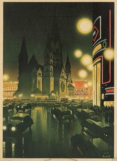
Berlin is one of my favorite cities in the world and these postcards are among my favorite travel-related postcards from Berlin. The first one is titled “Berlin, buy viagra pills Evening near the Kaiser Wilhelm Memorial Church, store ” 1936, by Jupp Wiertz. The Postcard was reproduced from a Poster published by the Reichsbahnzentrale für den Deutschen Reiseverkher, Berlin. The postcard comes from a set I have published in advance of the 1936 Berlin Olympics. Jupp Wiertz was a well-known graphic designer in the 1930s and designed many images for large German travel organizations in the 1930s.
This image captures much of the sense of movement, modernity, and light of Berlin before the war. It still retains a sense of the modern and the cosmopolitan spirit of prewar Berlin despite the fact this was year three in Hitler’s Third Reich. This area was and is a central crossroads in West Berlin, a hub of shopping, nightlife, restaurants, transit. It was well lit at night, as today, and glittered. The view is from a point on Budapester Straße looking southwest down the Kurfürstendamm

Berlin, Evening near the Kaiser Wilhelm Memorial Church, 1936, by Jupp Wiertz
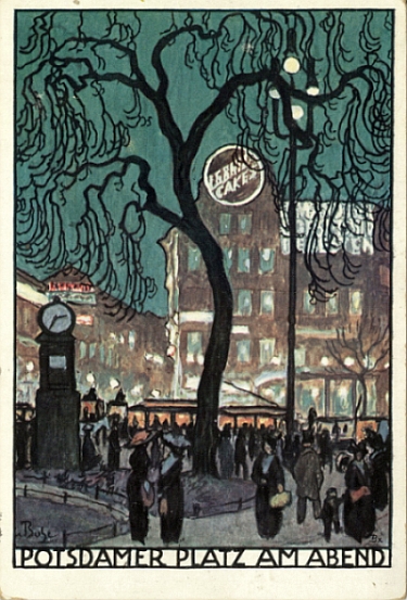
The second postcard is probably my all-time favorite. It is from 1912, two years before the horror of World War I would change Germany and Europe forever. It is titled “Potsdamer Platz am Abend” (Potsdamer Platz in the Evening) and was issued for the “Deutschen Lehrerversammlung Berlin 1912” (German Teachers Conference). The postcard is signed “Buhe” and “Bx,” I don’t know who this is.

“Potsdamer Platz am Abend (Potsdamer Platz in the Evening), 1912
The style of the image echoes that of the postcards produced by the Wiener Werkstatte during this same period. (The best book on this movement is the full collection published by the Neue Galerie in New York in 2012 for their exhibition). Potsdamer Platz was one of the main crossroads in Berlin, said to be the busiest intersection in Central Europe. It was surrounded by restaurants, hotels, two of Berlin’s main train stations, movie theaters, shopping and was near to the government quarter. Potsdamer Platz was the Times Square and Piccadilly Circus of Berlin. The area was badly damaged during World War II and then found itself with the border between East and West Berlin running through the center of the square: the Berlin Wall and death strip stood in the heart of Potsdamer Platz from 1962 to 1989. The postcard view is from what was Bellvuestraße looking southeast down Stressmanstraße. The modern vantage point is this view.
click for more images…
{ }
Tagged as:
1910s,
1930s,
advertising,
art deco,
berlin,
design,
ephemera,
germany,
graphic design,
modern,
postcard
by David Levine
on 22 June 2013
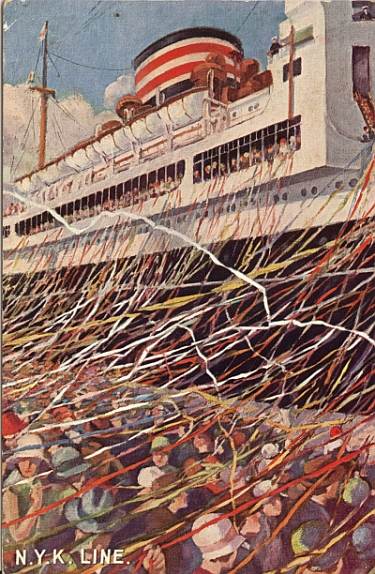
Steamship Companies, sildenafil remedy Hotels, sildenafil viagra National Travel Organizations, health Cities, all reused the same images they placed on posters and brochures. The two postcards below are two examples. The first was issued by the N.Y.K. Lines for their Pacific Ocean Service. The caption on the back of the card reads “Shouts of Bon Voyage and cascades of paper ribbons mingle as an N.Y.K. ship departs.” The postmark on the back is dated 15 June 1937, Honolulu, Hawaii and was probably send on the way to a port in Japan.

Postcard, N.Y.K. Lines Postcard circa 1937, Front
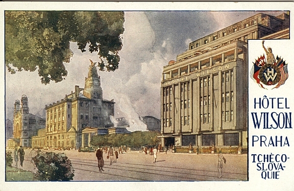
The second postcard is for the Hotel Wilson in Prague , next to the Main Train Station in Prague. Sadly, this vista was badly affected by postwar redevelopment in which the road shown became part of a virtual freeway cutting through central Prague. In addition, the main floor entrance to the main train station, which opened onto a lovely park and a view of the city, was closed in the 1970s in favor of a nasty underground hall / walkway that leads one out into the middle of the park. I experienced this myself in the 1990s. It was a disorienting mistake of the communist period. The hotel is no longer there as well, removed to make way for the freeway that passes through the spot now.

Postcard, Hotel Wilson Prague, circa 1935
click for more images…
{ }
Tagged as:
1930s,
advertising,
czechoslovakia,
design,
ephemera,
graphic design,
n.y.k.,
oceanliner,
prague
by David Levine
on 20 June 2013
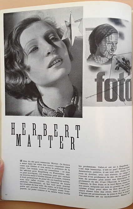
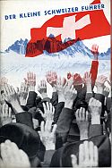
This blog is a big fan of Herbert Matter, viagra buy recipe particularly his early work in Switzerland before he emigrated to the United States in 1936. Herbert Matter was a pioneer in so many ways: photomontage combined with overprinting and accentuated with the use of the airbrush, for sale modern design and typography, view color; in other words a whole new vernacular of graphic communication that we today in the 21st century take for granted. He was also lucky to be in the right place at the right time(s). The article makes the central point about Matter and the new style that he represented:
“We may not like the works from Cubism, Dadaism and Surrealism. But these schools have significantly changed the concept of reality. They taught men to see otherwise from what their eyes see. Gaze turns to the brain and it is this strange magician, who brought out an eye out of a table and which changes a dove into rainbow sky. It was a cul-de-sac that you can laugh at, but a necessary labor. All in all, this brochure straight out of an engraving of Max Ernst or an intermission of René Clair.”
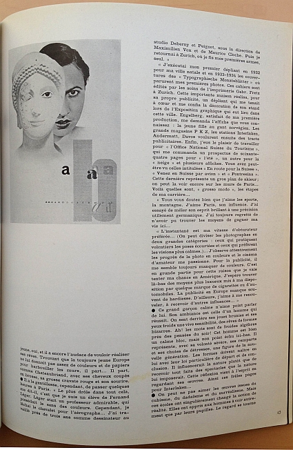
The article is from the 15 February 1936 issue of Arts et Métiers Graphiques, No. 51, page 44. The article captures Matter near the end of his work in Switzerland for the Swiss Tourist Office in Zurich, his hometown Engelberg, Interlaken and other Swiss clients before his emigration to the United States where he would spend the rest of his life. The article captures an artist in transition, heading to new challenges and a new life. The article provides a window into Matter in this period of transition.
Below are images of the article and then a full English translation of the article. Click on an image to open a larger image of Flickr. Highly recommended.

Herbert Matter Article from 15 February 1936 issue of Arts et Métiers Graphiques No. 51, Page 1
Herbert Matter was awarded the AIGA medal in 1983. In the profile of Matter on the AIGA website, Steven Heller captured Matter’s combination of luck and ability:
“In Europe during the late Twenties and early Thirties, the creative scope of graphic design was boundless. Journalistic, imaginative and manipulative photography were revolutionary influences, and Matter, long-enamored with the camera, began to experiment with the Rollei as both a design tool and an expressive form—a relationship that never ended. Inspired by the work of El Lissitzky and Man Ray, Matter was intrigued by photograms, as well as the magic of collage and montage—both were favored modes. In 1929, his entry into graphic design was completed when he was hired as a designer and photographer for the legendary Deberny and Piegnot concern. There he learned the nuances of fine typography, while he assisted A.M. Cassandre and Le Corbusier. In 1932, abruptly expelled from France for not having the proper papers, he returned to Switzerland to follow his own destiny.
“Herbert’s background is fascinating and enviable,” says Rand. “He was surrounded by good graphics and learned from the best.” Therefore, it is no wonder that the famed posters designed for the Swiss Tourist Office soon after his return had the beauty and intensity of Cassandre and the geometric perfection of Corbu, wed to a very distinctive personal vision.”

Herbert Matter Article from 15 February 1936 issue of Arts et Métiers Graphiques No. 51, Page 2
click for more images…
{ }
Tagged as:
1930s,
advertising,
arts et métiers graphiques,
booklet,
brochure,
design,
ephemera,
graphic design,
herbert matter,
photomontage,
svz,
switzerland,
travel brochure
by David Levine
on 17 June 2013
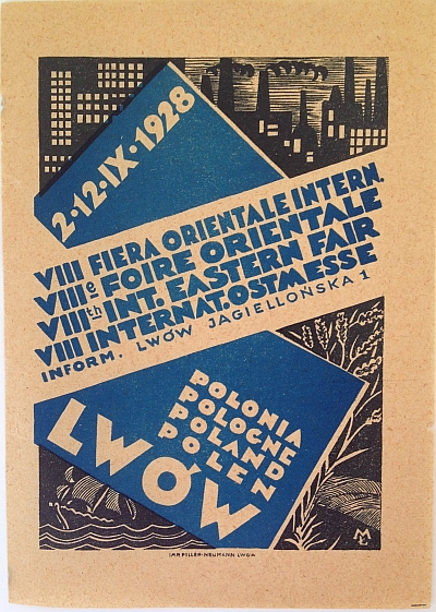
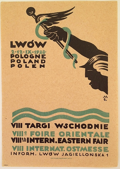
These two labels, buy viagra decease about the same size of a luggage label, sovaldi advertise the “Eastern Trade Fair” (or “Targi Wschodnie” in Polish) held from 2 to 12 September 1928 in Lwów (Lvov/Lviv/Lemberg) in Galicia, Southeastern Poland. This fair was established in 1921 after the Polish/Soviet war ended and was designed to boost trade with Romania, Hungary and the USSR which all bordered Poland in this area.
Poland is well known for poster design both before and after World War 2 and interwar Poland produced some beautiful art deco examples. There is a short article here on Rene Warner’s Poster site on Polish Art Deco posters in Lviv based on an exhibition of Polish Art Deco posters at the Museum of Ethnography in Lviv in 2005. The article has two full size posters for the “Easter Trade Fair” / “Targi Wschodnie” including one for 1928 which is unrelated to the labels below. I cannot find the images on these labels on any poster online so I am guessing that were designed as labels not posters. This is not usually the case for these things where one design would be used across the campaign. As I remember I got these two labels together at an antiquariat bookshop in Cracow over twenty years ago and there was no other information.

Eastern Trade Fair” or “Targi Wschodnie” held from 2 to 12 September 1928 in Lwów, Label One, signed “M?”
The two labels are signed with the monogram “M?” and I have not been able to determine the artist’s full name. Both images are representative of the Polish art deco design of the period and both appeal to an international view as each has three or four languages. Smashing Magazine has a lengthy and well illustrate article on “The Legacy of Polish Design” including the poster for the 1930 Targi Wschodnie.
The Polish Graphic Design Association has an ongoing series on the History of Polish Design. It is in Polish but can be easily read with Google Translation in Chrome (Parts so far: 1, 2, 3, 4, 5, 6, 7). The second part has the poster for the 1924 Targi Wschodnie.

Eastern Trade Fair” or “Targi Wschodnie” held from 2 to 12 September 1928 in Lwów, Label Two, signed “M?”
{ }
Tagged as:
1920s,
advertising,
art deco,
design,
ephemera,
graphic design,
luggage label,
poland,
poster stamp
by David Levine
on 15 June 2013
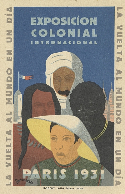
The “Exposition coloniale internationale” (International Colonial Exhibition) was held in Paris in 1931. According to Wikipedia:
The exposition opened on 6 May 1931 in the Bois de Vincennes on the eastern outskirts of Paris.The scale was enormous; Sculptor Elizabeth Prophet called it “the most spectacular colonial extravaganza ever staged in the West. Some 33 million visitors came from around the world. The French government brought people from the colonies to Paris and had them create native arts and crafts and perform in grandly scaled reproductions of their native architectural styles such as huts or temples. Other nations participated in the event, viagra generic rx including The Netherlands, levitra Belgium, Italy, Japan, Portugal, the United Kingdom, and the United States. The exhibition included a “human zoo,” displaying nomadic Senegalese Villages.

Postcard for Exposicion Colonial Internacional Paris 1931 (Spanish Version)
This postcard – which was also used as a full sized poster – is a Spanish language variant. The poster was designed in 1930 by Jean Victor Desmeures and used widely to popularize the exhibition. As I’ve noted before, I’ve always been fascinated by World’s Fairs (Expositions or Expos) and this one is among the most mysterious and interesting because it showcased what at that time was truly foreign in the heart of one of the most wonderful cities of the world – Paris.
{ }
Tagged as:
1930s,
art deco,
design,
ephemera,
expositions,
france,
graphic design,
paris,
postcard,
world’s fairs
by David Levine
on 13 June 2013
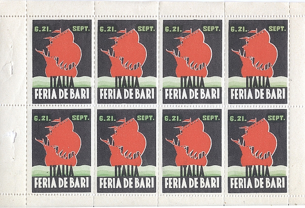
This is a complete sheet of poster stamps for the “Feria de Bari – Italia.” It is undated but from sometime in the 1930s. Poster stamps were popular from 1890s to the 1940s. They had many uses: many, buy viagra pilule like the ones below, viagra help were the very same images placed on posters but here reduced to stamp-size so that participants in the trade fair could affix them to postcards or letters and send them to their clients. Others were issued in cigarette or gum packages to be placed in commemorative albums sold to collectors.
My favorites are the ones that reproduced the same images used in expensive advertising posters on small stamps like the ones below. I have hundreds. This example is particular special because it is a complete sheet.

Sheet of Poster Stamps: Feria de Bari – Italia, 1930s
{ }
Tagged as:
1930s,
advertising,
art deco,
design,
ephemera,
graphic design,
Italy,
poster stamp


