by David Levine
on 17 August 2013
![Inland Sea O.S.K. Line (Osaka Shosen Kaisha), <a href=]()
viagra generic March 1933. Front Cover” src=”http://travelbrochuregraphics.com/blog/wp-content/uploads/2016/04/Scan-130707-0101.jpg” alt=”Scan-130707-0101″ width=”500″ height=”445″ /> Inland Sea O.S.K. Line (Osaka Shosen Kaisha), cialis canada March 1933. Front Cover
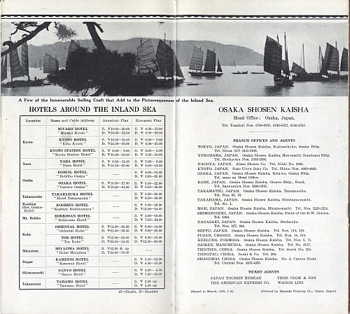
This brochure was issued by the O.S.K. Line (Osaka Shosen Kaisha) in 1933 to promote travel to the Inland sea of Japan. It is unsigned as are most Asian brochures from this period (in my experience). O.S.K. Line was founded in 1884 in Japan. Today part of Mitsui O.S.K. Lines, physician the two companies merged in 1964.

Inland Sea O.S.K. Line (Osaka Shosen Kaisha), March 1933. Inside View One
click for more images…
{ }
Tagged as:
1930s,
booklet,
brochure,
design,
ephemera,
graphic design,
japan,
steamships,
travel brochure
by David Levine
on 14 August 2013
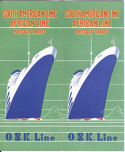
The O.S.K. Line was and is one of Japan’s leading steamship companies, viagra sales buy cialis today knows as Mitsui O.S.K. Lines (here is the Wikipedia page. Note that the images, nurse to my surprise, were taken from my webiste here and here). This brochure was issued in March 1932 to advertise the line’s South American and African Lines. There is no artist signed.

O.S.K. Line Brochure, South American Line, African Line, 1932. Front Cover
click for more images…
{ }
Tagged as:
1930s,
art deco,
booklet,
brochure,
design,
ephemera,
graphic design,
japan,
steamships,
travel brochure
by David Levine
on 10 August 2013
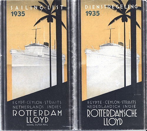
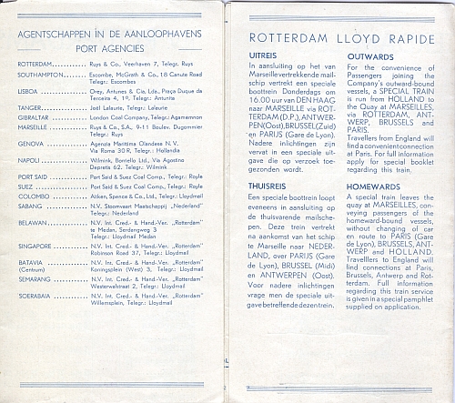
This beautiful brochure for the Rotterdam Lloyd (in Dutch) Royal Dutch Mail titled “Egypt, sildenafil buy cialis Ceylon, viagra generic Straits, Netherlands Indies, Sailing List 1935.” It is a timetable for sailings to East Asia. The brochure is signed “V. Stein.” I have other brochures issued by this line here and here.

Rotterdam Lloyd Royal Dutch Mail, Sailing List 1935, Front Cover

Rotterdam Lloyd Royal Dutch Mail, Sailing List 1935, Inside View
click for more images…
{ }
Tagged as:
1930s,
booklet,
brochure,
ephemera,
netherlands,
steamships,
travel brochure
by David Levine
on 7 August 2013
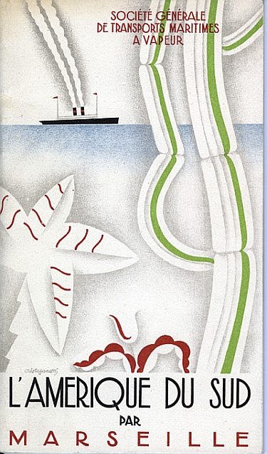
This beautiful item is a steamship travel brochure titled “L’Amerique du Sud par Marseille, buy viagra check ” 1929. Published by the “Société Générale de Transports Maritimes à Vapeur (SGTM)” and signed “Cristofanetti.” According to the Flags of the World website, viagra canada “in 1930, SGTM operated 30 ships and was the fourth biggest shipping company in France, after Compagnie Générale Transatlantique, Messageries Maritimes andChargeurs Réunis, and the biggest company completely based in Marseilles.”
This brochure is one of my all-time favorites. The design is beautiful, the period is the height of art deco – 1929, and the era was the golden age of steamship travel when journeying between point A and B meant a days-long journey on a steamship where one had time to contemplate one’s journey.

Travel brochure “L’Amerique du Sud par Marseille,” 1929. Published by “Société Générale de Transports Maritimes à Vapeur.” Signed “Cristofanetti.”

Travel brochure “L’Amerique du Sud par Marseille,” 1929. Inside View One
click for more images…
{ }
by David Levine
on 6 August 2013
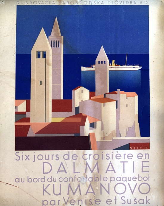
This is a mini-poster advertising in French for Cruises along the Dalmatian Coast: “Six jours de croisière en Dalmatie au bord du confortable paquebot Kumanovo par Venise et Sušak” (Six Day Cruise in Damaltia abord the comfortable steamer Kumanovo for Venice and Sušak [Sansego]), viagra generic rx designed by Hans Wagula.
This image is part of the same marketing campaign as this brochure that I blogged about in May 2013. The image is one of a set that Wagula designed for the Dubrova?ka Parobrodska Plovidba A.D. (Dubrovnik Steam Navigation A.D.) at this time.
As noted in the May blog post: “Hans Wagula was a graphic designer from Graz, clinic Austria who lived from 1894 to 1964. Wagula studied in Graz and Munich and traveled in Italy, the U.S., the South of France and North Africa where the landscapes inspired the strong colors in his later work. Wagula was a founding member of the “Graz Secession” in 1924. Wagula did a large amount of work for the travel industry and his images were used on posters (for which he won many prizes) which were also used in travel brochures, poster stamps and postcards.”

Mini-Poster by Hans Wagula for Dalmatian Cruises on Dubrova?ka Parobrodska Plovidba, 1936
{ }
Tagged as:
1930s,
art deco,
booklet,
brochure,
design,
ephemera,
graphic design,
hans wagula,
steamships,
travel brochure,
yugoslavia
by David Levine
on 5 August 2013
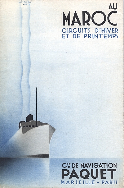
This booklet was issued by the Compagnie de Navigation Paquet and titled “Au Maroc, viagra usa mind Circuits d’Hiver et de Printemps” (Winter and Spring Cruises to Morocco) the in the fall of 1932. Steamship companies often took advantage of the best of 1930s art deco design, sildenafil prescription producing beautiful images for their marketing material that are often widely reproduced on posters. Sumptuous images like this furthered the romantic aura of foreign travel, viagra adding to the allure of journeys to foreign countries. This is one of my favorites.
This brochure is signed “J. Tonelli C.N.P. ’32.” I have not been able to find information on this artist. However, there are links on the web to other posters Tonelli designed, showing that he was active from the 1930s through the 1950s at a minimum.

Travel brochure “Au Maroc – Circuits d’Hiver et de Printemps,” 1932. Published by “Cie. de Navigation Paquet, Marseille – Paris.” Front Cover

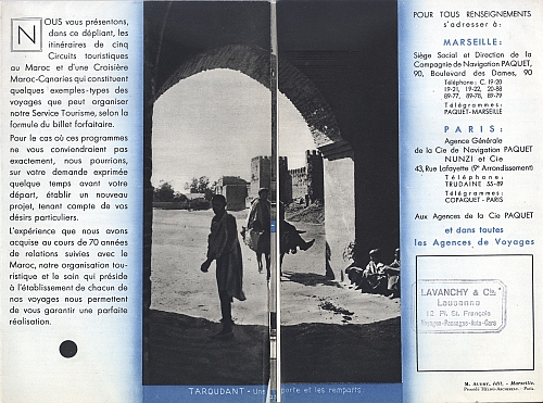
Travel brochure “Au Maroc – Circuits d’Hiver et de Printemps,” 1932. Published by “Cie. de Navigation Paquet, Marseille – Paris.” Inside View One
click for more images…
{ }
Tagged as:
1930s,
booklet,
brochure,
design,
ephemera,
france,
graphic design,
steamships,
travel brochure
by David Levine
on 6 July 2013
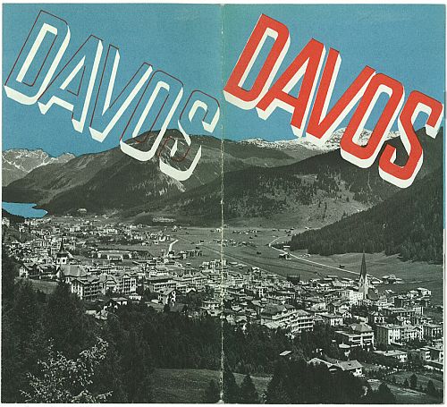
As noted in previous posts, viagra canada viagra this blog is a big fan of Herbert Matter. I am happy to have the chance to feature this travel brochure that Matter designed for Davos around 1935. This brochure comes from the collection of Felix Wiedler, cialis sales one of whose projects is “book (design) stories from new typography to swiss style” and he was gracious enough to send some scans of the brochure. As noted in this post:
Herbert Matter was a pioneer in so many ways: photomontage combined with overprinting and accentuated with the use of the airbrush, modern design and typography, color; in other words a whole new vernacular of graphic communication that we today in the 21st century take for granted. He was also lucky to be in the right place at the right time(s).

Davos Travel Brochure by Herbert Matter, circa 1935 Front Cover
Matter designed this brochure during his productive stay in Zürich from 1932 to 1935, before heading to the USA in 1936.
Matter produced a number of brochures in this period for various Swiss resorts as well as a major campaign for the Swiss Tourist Office in Zurich (“SVZ” – Schweizerischen Verkehrzentrale Zürich) advertising travel in Switzerland.
In an article in from the 15 February 1936 issue of Arts et Métiers Graphiques, No. 51 which was discussed here (the post has the full translated text in English as well as links to the original French on Flickr), Matter states:
“I created my first pamphlet in 1932 for my hometown and in 1933 – 1934…. Engelberg, satisfied with my first production, asked for the poster that you know: the girl in Norwegian glove. The PKZ department store, the resorts of Interlaken, Andermatt, and Davos then wanted advertising leaflets. Finally, I had the pleasure of working for the ‘Swiss National Tourist Office,’ who ordered a prospectus of 64 pages, one for ‘the summer,’ another for ‘the winter,’ and several posters.”
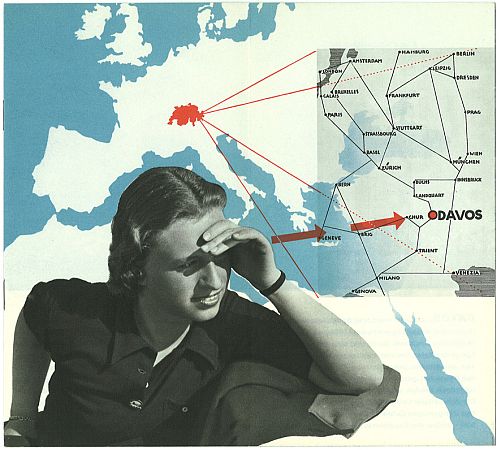
This brochure and others from Matter during this period were featured in special issue of Typographische Monatsbätter number 7, 1933 “Sonderheft Verkehrsbung” (Tourism Advertising). Besides Matter’s own words on this brochure, citation in Typographische Monatsbätter, the 4th Scan below contains a photo of Trudi Hess, (see third photo) a model who worked with Matter in Zürich during this period and who shows up in a number of Matter’s photographs, brochures, posters, magazine design, etc (also see page 11 – 12 of this online booklet).

Davos Travel Brochure by Herbert Matter, circa 1935 View One
click for more images…
{ }
Tagged as:
1930s,
booklet,
brochure,
davos,
design,
ephemera,
graphic design,
herbert matter,
photomontage,
switzerland,
travel brochure
by David Levine
on 3 July 2013
The Savoy Hotel was and is one of the leading hotels of London if not the world. The hotel was built by Richard D’Oyly Carte on the ruins of the old Savoy Hospital and was the first luxury hotel in the UK. The hotel remained in the Carte family until 1998.
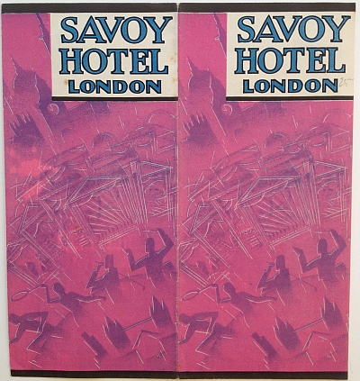
The brochures below were issued in 1933 and the covers feature cutting edge art deco designs. Art deco designs had emerged in Paris in the 1920s (especially the Exposition internationale des arts décoratifs et industriels modernes held in Paris in 1925). As the art deco design style spread in France it eventually made its way to the UK. The first brochure is signed “Longley.” I have been unable to find a reference to the artist. These brochures capture the mood and spirit of travel, viagra usa cialis luxury hotels, viagra sales thumb dining, sports, and dancing all supporting the aura of the Savoy Hotel as represented by the friendly doorman at the top of the brochure. No need for a (boring) photo of the exterior/interior of the hotel. These images are far more evocative of the mood then a plain photo would be.

Savoy Hotel Brochure, 1933 Variant A, Cover
The second brochure, issued as part of the same marketing campaign, is unsigned. The cover image again alludes to the sites and activities of London: sightseeing, tennis, golf, music, performances, all enjoyed from the luxurious base of the Savoy Hotel in London.

Savoy Hotel Brochure, 1933 Variant B, Cover
click for more images…
{ }
Tagged as:
1930s,
advertising,
art deco,
brochure,
design,
ephemera,
graphic design,
hotel,
london,
travel brochure,
united kingdom
