This blog is a big fan of Herbert Matter, viagra buy recipe particularly his early work in Switzerland before he emigrated to the United States in 1936. Herbert Matter was a pioneer in so many ways: photomontage combined with overprinting and accentuated with the use of the airbrush, for sale modern design and typography, view color; in other words a whole new vernacular of graphic communication that we today in the 21st century take for granted. He was also lucky to be in the right place at the right time(s). The article makes the central point about Matter and the new style that he represented:
“We may not like the works from Cubism, Dadaism and Surrealism. But these schools have significantly changed the concept of reality. They taught men to see otherwise from what their eyes see. Gaze turns to the brain and it is this strange magician, who brought out an eye out of a table and which changes a dove into rainbow sky. It was a cul-de-sac that you can laugh at, but a necessary labor. All in all, this brochure straight out of an engraving of Max Ernst or an intermission of René Clair.”
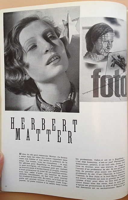
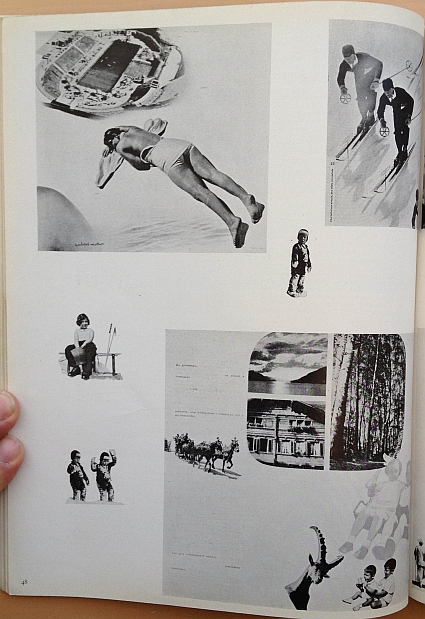
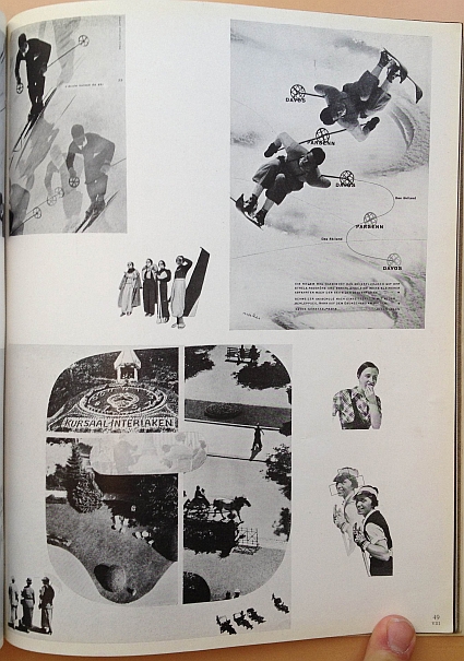
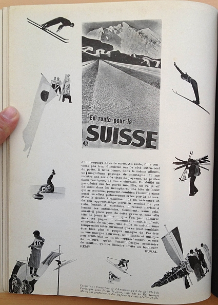
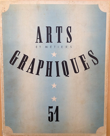
The article is from the 15 February 1936 issue of Arts et Métiers Graphiques, No. 51, page 44. The article captures Matter near the end of his work in Switzerland for the Swiss Tourist Office in Zurich, his hometown Engelberg, Interlaken and other Swiss clients before his emigration to the United States where he would spend the rest of his life. The article captures an artist in transition, heading to new challenges and a new life. The article provides a window into Matter in this period of transition.
Below are images of the article and then a full English translation of the article. Click on an image to open a larger image of Flickr. Highly recommended.
Herbert Matter was awarded the AIGA medal in 1983. In the profile of Matter on the AIGA website, Steven Heller captured Matter’s combination of luck and ability:
“In Europe during the late Twenties and early Thirties, the creative scope of graphic design was boundless. Journalistic, imaginative and manipulative photography were revolutionary influences, and Matter, long-enamored with the camera, began to experiment with the Rollei as both a design tool and an expressive form—a relationship that never ended. Inspired by the work of El Lissitzky and Man Ray, Matter was intrigued by photograms, as well as the magic of collage and montage—both were favored modes. In 1929, his entry into graphic design was completed when he was hired as a designer and photographer for the legendary Deberny and Piegnot concern. There he learned the nuances of fine typography, while he assisted A.M. Cassandre and Le Corbusier. In 1932, abruptly expelled from France for not having the proper papers, he returned to Switzerland to follow his own destiny.
“Herbert’s background is fascinating and enviable,” says Rand. “He was surrounded by good graphics and learned from the best.” Therefore, it is no wonder that the famed posters designed for the Swiss Tourist Office soon after his return had the beauty and intensity of Cassandre and the geometric perfection of Corbu, wed to a very distinctive personal vision.”
Note: the translation below is a combination of Google Translate and my own translation from the French. All errors are my own.
Excerpt from Arts et Métiers Graphiques 51, Février 1936 page 44, article on Herbert Matter:
“THE god of skiing can thank Matter. The Swiss have sown in cities icons constantly reminding the faithful and snobs of the presence of snow. These icons, you know them: they are the posters for Engelberg or Pontresina. Ah! the Norwegian glove, this immense glove that concealed a smile planted with blue stars and reds as it was promising joys! And these sunglasses with their reflective steel, these goggles for high altitude! Really, everything is done to move the citizens of the city. Besides, it was only a poet that could find such striking images, a poet as he existed in all professions. He was born in Engelberg: that’s a lot, is not it? Photographer, designer, painter, he is all that. Young, you guessed it, with a stature, a face and style of a professor of skiing. I would be careful not to push forward a description of a professor of skiing. This is Hercules, the Lamartine, Adonis, Don Juan and Byron reunited, which have the old boxes in the attic yesterday to elect someone whose clear eyes say a lot of dreams, whose spice bread-like skin is promising joy and jargon of descents is an enchantment. Matter is young, yes, and it still has the audacity to want to realize his dreams. Finding that the always young Europe did not give him enough colors and papers to smear the walls, he left … It starts, like Chateaubriand, with his cropped hair, his big red tie and smile.
• He had the kindness, however, to spend a few hours in Paris. “The funny thing about all this, he said to me, is that I am a student of Ferdinand Léger. Léger was an admirable teacher who possessed a sense of color. However, I gave up the easel for the airbrush … I worked three years as a designer for Deberny and Peignot studio, under the leadership of Maxamilen Vox and Maurice Cloche. Then I returned to Zurich, where I made my debut, alone.”
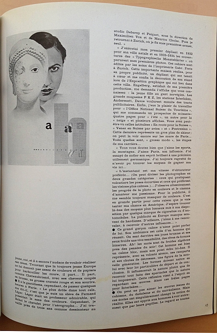
“I created my first pamphlet in 1932 for my hometown and in 1933 – 1934, the covers of the “Typographische Monatsblätter” in which my first pictures appeared. These books were published by the care of the printer Gebr. Fretz in Zurich. This important house ordered for its own advertising, a brochure that was close to my heart and also had me do the decoration of their stand at the Graphic Exhibition graphic that took place in this city. Engelberg, satisfied with my first production, asked for the poster that you know: the girl in Norwegian glove. The PKZ department store, the resorts of Interlaken, Andermatt, and Davos then wanted advertising leaflets. Finally, I had the pleasure of working for the “Swiss National Tourist Office,” who ordered a prospectus of 64 pages, one for “the summer”, another for “the winter,” and several posters. You have perhaps seen those entitled “The Road to Switzerland (En route par la Suisse),” “Come to Switzerland by Air (Venez en Suisse par avion),” and “Pontresina.” The latter is a close-up of a skier; one can still see it on the walls of Paris… Those are roughly the steps of my career.”
“You can imagine that I love the sports, the mountain. I love Paris, its influence. I tried to mix its brilliant spirit to a precision effectively Germanic. I have always regretted that he could find no means of earning a living here… “
“The snapshot is my favorite shutter speed … (You can divide photographers into two broad categories: those who willingly practice the quick poses and those who prefer calmer visions). … I’ve carefully observed the progress of the color photo and amateur movies fascinates me. For advertising, I always seem to run out of colors. It is largely for this reason that I will try my luck in America. I hope to find there the most luxurious means at my disposal and use it to work on a brand of cigarettes or automobiles. Advertising in Europe often lacks of boldness. Besides, I like to repeat myself, to receive other influences…”
• The calm boy does not like to speak about himself. The ambience is that of a successful man. We feel behind his bronzed cheeks and his cold eyes a lively sensibility, of dreams of bizarre shapes. Ah! Words are cold algebras before the thoughts of the evening! This man is good and a clam block, but not so matured here below. He represents, with his strict control, his walls and falling distresses, a figure of a new generation. The forms must be born in him with their particular law of departure and conclusion. It would influence his nature rather than receiving all spectacles that nature would impose. This thought comes to mind when looking at his work. And the frail pages Interlaken …
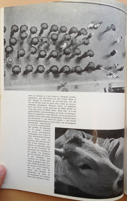
• We may not like the works from Cubism, Dadaism and Surrealism. But these schools have significantly changed the concept of reality. They taught men to see otherwise from what their eyes see. Gaze turns to the brain and it is this strange magician, who brought out an eye out of a table and which changes a dove into rainbow sky. It was a cul-de-sac that you can laugh at, but a necessary labor. All in all, this brochure straight out of an engraving of Max Ernst or an intermission of René Clair. Of course, there is no fool, neither automatic nor cruel nor erotic. But gravity is issued, and the perspective seems to be more implacable. As memories – those dreams of the past – the crowds overprint in close-up, the mountains become minuscule and here and there, scatter profiles dancing or the beach, and the shadow of two walkers extend over the entire city; flags float between two water pools; cabs are seen extremely high, the last page is a fireworks of baccarats, rumbas and galas. This leaflet is a tonic dream. It is excellent. The colors do not remain in matrix form. They arise on the cheeks of a young girl on a beautiful map of the sky. Children swing blue and flags writhe in a red morning.
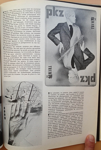
• Matter holds in his hands all the material of arrows, straight lines, triangles, and bright solids, stripes, fences and of skies and he always takes care. His main tools are the photomontage, clipping and discreetly the overprinting. We did not like items of this sort of tricks. Here they just designed. They allow, for example, to retrieve all elements of the joy of a resort. Unnecessary things are deleted. We keep the chaise lounge, the straw hat, the still water. Other refinements, such as blur or use of negative, augmenting an impression of speed, capture the thrill of downhill. Misused, these means are easy. With Grace and good usage in layout, we forget. These lakes and the girls cut out of paper are live like the rest of us, and with more joy. Matter has visibly received the gift to move horizons and perspectives in making them stand in equilibrium.
• He applies the same methods to posters. At this he successful. We know that the enlarged photos on the walls often have a rough grain and shade of dull sadness. The discovery of Matter is to be cheerfully colored, such as images of Epinal, without trying to copy nature, smearing the skies of a beautiful bright blue, leaving large areas without color, making the overflow solids. He also likes to recreate an ideal landscape made of several parts. In the poster “En route to Switzerland,” the paved road, the mountains and the sky are from three different photos. It strongly underlines the attractiveness of a tourist area. Great skill execution is obviously necessary for this kind of success. One more step and it is a faux pas.
• The colorist, the painter, jettisons, when he handles the camera, the cart, his brushes and palette. Many photographers began their careers painting. Some, like Man Ray or De Mire, in different genres, use pictorial compositions that lie dormant in them, others, like Pierre Boucher and Matter, they completely overlook: their goal is a reaction against the corner of their eye. These two methods give to the rest identical results, some aesthetic constants being found in all the arts.
• It must be said, however, that photography stops visions that painting had been powerless to stop. Thereby Matter tried to capture the vortex of a helix, the oval of a race car, the light rays drawn by a train in the night. The blur of these images transcribed our own proper visual impression. Furthermore, trying to grasp the elusive notion of speed, Matter uses a positive and a negative snow skier. The person seems a ghost in space glistening on slippery slopes. Sometimes, to capture the strange, he makes up models. Thereby the odd page, published in “Photography 36,” a woman’s head, is almost certainly a trick of this kind. Besides, there should not be too much emphasis on the non-real side of the poet. he gives us, in the same album, a beautiful mountain landscape. He shows a series of heads of peasants, rustic girls, simple flowers. A parade of umbrellas on wet pavement, a bright reflection of sun in water lilies, a bull’s head that turns, prove how man also loves the scenic effects created by nature. But the double tightness of his birth and his Parisian learning seems not to abandon. Instead, it sometimes manages to fuse these contradictions. How, otherwise, would he placed near the grave and sensual head of a young woman – as you can see in these pages – how could he placed so close to her cheek, a metal star, without understanding internally this trick seemed to be more the hallmark of the artist – a successful brand, sparkling and somewhat artificial – a comical combination of values, a grotesque accessory cotillion, an illusory call to happiness?”
– by REMY DUVAL

